
Transparent Path
A new dashboard home screen, UI refresh, and navigation redesign for tracking sensors and food deliveries.
DURATION
3 Weeks
MY ROLE
Design: Project management, sketching, hi-fi prototype [in collaboration with team members], client presentation
Research: User interviews, affinity mapping, competitive analysis, and prototype testing
Collaborators: Evan Iroh, Faiz Khan, Charity Kamara, Minakshi Chouhan
✨Short on time? Click here to skip to the final prototype and next steps✨
Overview
The problem: Compared to other sensor tracking platforms, the following issues have been identified in regards to the existing Transparent Path app: clunky and unclear navigation, lack of dashboard screen for quickly referencing important metrics, a repetitive create shipment flow that doesn't allow for saved templates, lack of functionality to track and assign sensors, and a UI that isn't as clean, bright, and modern as they would like.
The solution: Creation of a dashboard view, sensor tracking functionality, navigation redesign, and UI facelift. There are other competitors in the industry, so it is important that the app provides the best user experience possible, and these revisions support that goal.
About Transparent Path
Transparent Path’s proprietary platform keeps an eye on the supply chain for perishables,
alerting producers, processors, transporters and retailers to problems so they can be
fixed in transit — reducing food waste and removing any doubts about freshness, quality
or diversion.
This
lack of transparency results in billions of dollars in food waste. Transparent Path uses
continuously connected sensors and artificial intelligence to help food producers know
when something goes wrong, act to fix it, and anticipate future issues before they occur.
Competitive Analysis
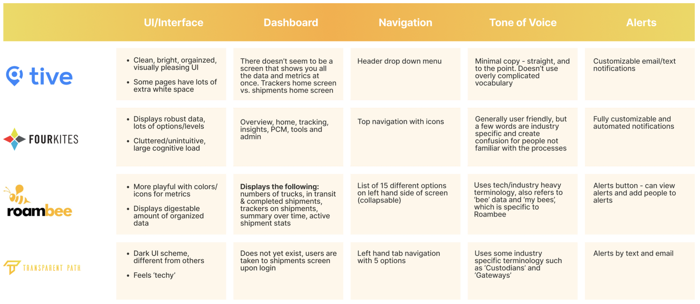
Competitive analysis chart [click to enlarge]
By examining the interfaces of other competitor's platforms, we were also better able to understand the flows and features potential users are familiar with.
In order to design the most useful and intuitive app experience possible, we needed to better understand our users.
Meet The Users!
We interviewed 6 people, ranging from Transparent Path employees/stakeholders, partners, and clients.
Key Takeaways:
“I need to reference data points for my job”
“I want alerts/notifications to stay ahead of shifts in data”
“I need a simple and efficient platform (navigation & UI)”
“I need a way to track, assign, and deploy sensors”
“I need certain platform features to do my job”
“I need a simple and efficient create shipment flow”
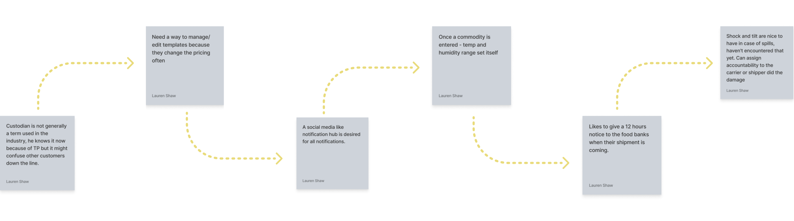
A few affinity map insights [click to enlarge]
User Personas
Our client, Transparent Path, previously curated two user personas to use as a guide for redesigning the app: Supply Chain Manager and Supply Chain Coordinator.
While keeping in mind the feedback we received from user interviews and our own insights, we needed to be sure our app catered to these two personas, as they would be the main users.

Transparent Path user personas
Problem Statements
Supply Chain Manager: This user needs a platform that is easy to learn and use that allows them to help their team & prioritize customer satisfaction.
Supply Chain Coordinator: This user needs a platform that is efficient so that management sees they can ensure shipments arrive on time and unharmed.
Existing App & Project Scope

Dashboard: Currently non-existent, and both personas need a way to quickly reference key metrics
Navigation: The existing left navigation bar takes up way too much space for how simple it is, causing the user to have to horizontal scroll to see all the information on the screen.
UX writing: Certain verbiage used throughout the app is not immediately clear to users even if they work in the field (ie: custodian).
Information Architecture: Items and custodians tabs are rarely referenced and could be moved out of the main nav to reduce cognitive load. We’ll examine where they could be better located.
Create Shipment Flow: Some of the pages/fields ask for information that is duplicative, the flow spans multiple pages and doesn't allow for templates because you have to save at each screen. This directly affects the day to day of the Supply Chain Coordinator.
Shipments Overview: Current configuration requires horizontal scrolling and the header blocks information, causing users to scroll vertically more than needed. We’ll also examine if all needed information is currently integrated into this view.
Sensor Management: This function currently doesn’t exist. Based on feedback from user interviews, external spreadsheets are being used to track and assign devices. This page will serve as a way to manage them without leaving the platform.
UI/Visual Design: Based on feedback from user interviews, the UI doesn’t feel modern and 'light' as as other platforms. A general redesign was requested by the client.
Design Studio Sketches
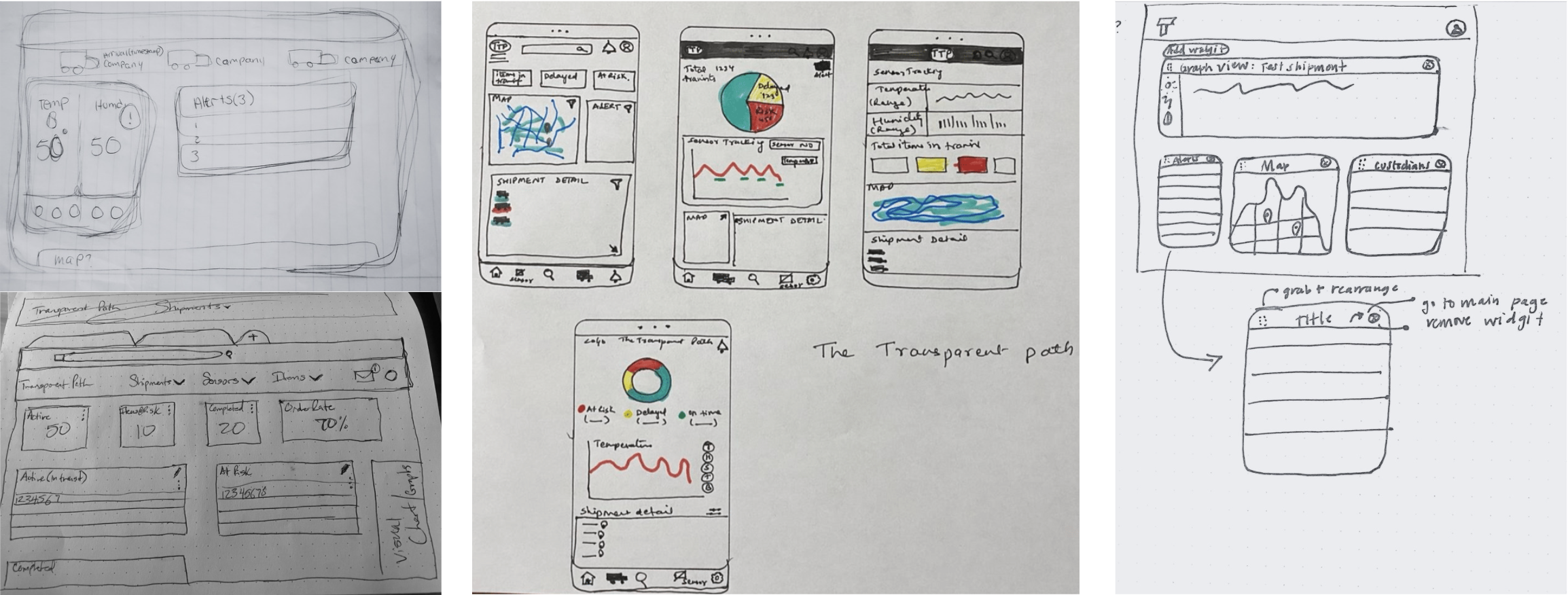
Design studio sketches [click to enlarge]
We created 3 different iterations of the app and conducted 2 rounds of user testing. Here’s what we designed and learned for each aspect of the interface.
Navigation Design
Navigation: Original Design
Key Points:
Left nav takes up way too much space for how simple it is, causing the user to have to horizontal scroll to see all the information on the screen.
Certain verbiage is not immediately clear to users (ie: custodian). There were a few iterations on this but we eventually settled on ‘shipment managers’ as a replacement.
‘Items’ and ‘Custodians’ tabs are rarely referenced and could be moved out of the main navigation to reduce cognitive load.
UI doesn’t feel feel modern and 'light'

Navigation: Version 2
Revisions:
Smaller, more compact labels & icons require less space and help to eliminate the need for scrolling.
Moved 'Items' and 'Shipment Managers’ to the ‘Manage’ tab, as they are not frequently accessed (feedback per user interviews).
Usability Test 1 Feedback:
Excess white space below navigation takes valuable dashboard space.
Users didn’t know where to manage templates, items, or carriers once they were removed from the main navigation.
We were able to validate that users understood the purpose of ‘shipment managers’ vs. ‘custodians’.

Navigation: Final Design
Post Usability Test 1 Revisions:
Relocated left navigation to top header to allow more space for page content.
Added the search icons, alerts hub, manage icon, and user image/name in the header.
Incorporated a light, modern UI/color scheme.
Post Usability Test 2 Revisions:
Changed the 'Create New Shipment" button to 'Create' in order to accommodate the flows for both shipments and templates.
Based on the feedback from usability testing, most users expected settings to be accessible by clicking the user name/photo, so we included a drop-down menu and removed the settings icon.
We added a greeting that would change depending on the time of day [Good morning, etc.] to add a bit of personality to the interface.
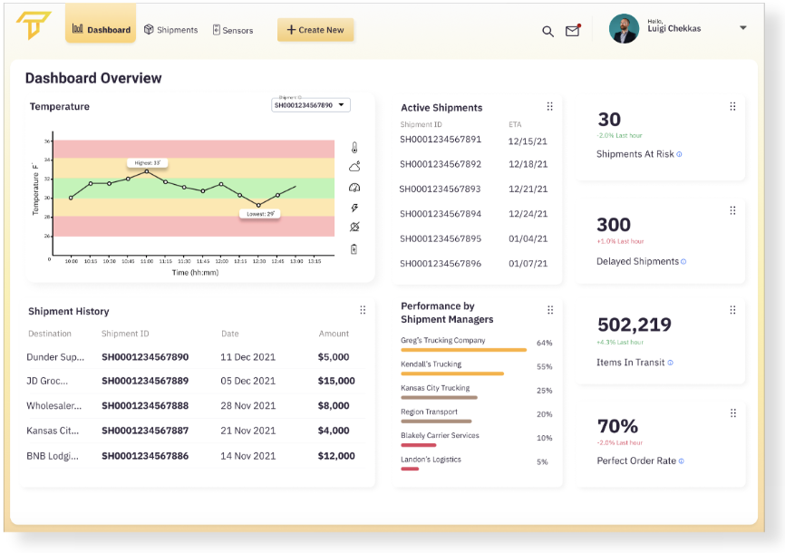
Dashboard

Dashboard: Initial Design
Key Points:
Eliminated horizontal scrolling that was identified by users and stakeholders as being frustrating.
Created alerts hub in top header.
Included key metrics at top of page.
Incorporated ‘widgets' for the data that can be dragged and minimized to allow for customization between users and for future development.
Usability Test 1 Feedback:
Users tended to go to the shipments page when asked to check shipments status instead of the dashboard.
Although the widget functionality was not included in the prototype, users attempted to customize the dashboard by manipulating them - this indicates the design of the widgets was intuitive.
Dashboard: Final Design
Usability Test 1 Revisions:
Integrated top navigation for maximum content space.
Added a ‘settings’ page to access account info and to manage templates and shipping managers.
Added info tags to provide context to terms users may not be familiar with.
Usability Test 2 Feedback:
Incorporated missing temperature data points that were identified as being very important to users - what time was the shipment when it arrived and left each location?
There was some confusion about the shipments by shipment manager widget - does it show data for all orders or just one order? We would need to explore how to address this in future revisions.
The 'Shipments at Risk' metric was identified by users as being important but was located near bottom of page, so we moved it to the top where it is more visible.
Create New Shipment Flow
We sought to simply the number of steps with templates and by examining requests for duplicative or unncessary information. By the end of our exploration, we were able to create a process that consisted of only 9 steps - a huge improvement!
![Create New Shipment: Original Flow = 14 steps [click to enlarge]](/s/P5-User-Flows2x-4-3jgj.png)
Create New Shipment: Original Flow = 14 steps [click to enlarge]
![Create New Shipment: New Flow = 9 steps [click to enlarge]](/s/P5-User-Flows2x-5-6fxd.png)
Create New Shipment: New Flow = 9 steps [click to enlarge]
Create Shipment: Original Design
Key Points:
Some of the pages/fields ask for information that is duplicative.
The flow spans many pages, and doesn't allow for templates because you have to save at each screen.
The save button does not provide feedback to show input was saved.
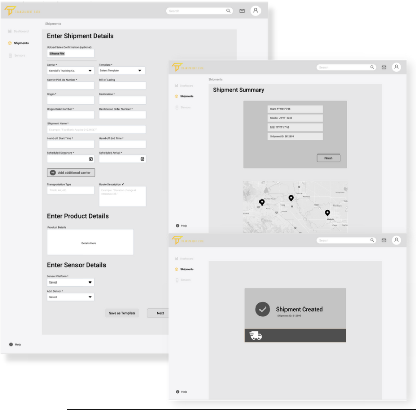
Create Shipment: Version 2
Revisions:
Added in templates functionality - users can import and save data from frequently executed shipments, which saves valuable time.
We rearranged order of fields to match the PDF exported from Fusionware [invoice software].
Added shipment summary page with an updated map to show the route.
Added final ‘shipment created’ screen which displays more in depth data to be verified and modified if needed.
Usability Test 1 Feedback:
Selecting 'save as template' does not provide any feedback that template is saved.
Users opted to use templates for filling in the form even if they did not fully understood what templates were for. There was confusion as to whether or not they filled in saved data or changed the available input fields.

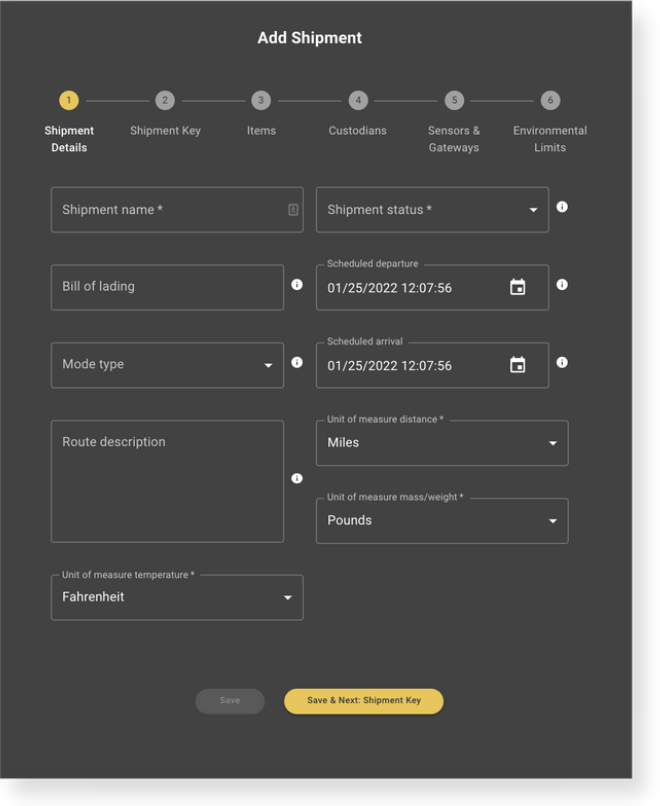
Create Shipment: Final Design
Usability Test 1 Revisions:
Added create shipment 'onboarding' screen which explains the concept of templates - we hoped to eliminate the confusion seen during testing as to whether they load saved data or change the available input fields. It explains how templates can be used and allows the user to either create a new shipment from a template, or create a template.
Added more information to the shipment summary page so that users can immediately verify their order is correct and revise as needed.
Usability Test 2 Feedback:
Missing temperature data in the create shipment flow and on the summary screen - this was a simple oversight and was added for the final version.
Shipments
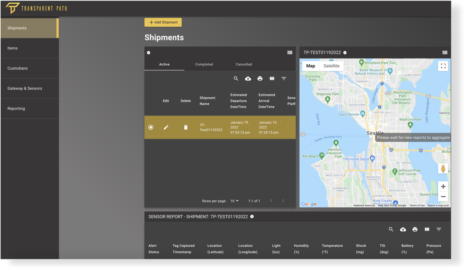
Shipments: Original Design
Key Points:
The current configuration requires horizontal scrolling - this was identified as a pain point in user and stakeholder interviews.
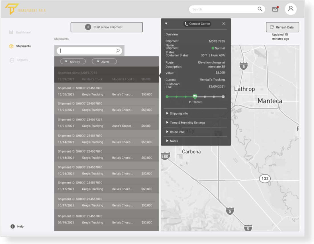
Shipments: Version 2
Revisions:
Added a search feature to easily locate shipments.
Added ability to contact the custodian in case a shipment needs attention.
Included the ability to click on the shipment to see details without horizontally scrolling.
Usability Test 1 Feedback:
Users commented on the fact the info. overlay covers the map, as you might want to see both at once.
Users want to see more of the map, it helps them quickly reference active shipments.

Shipments: Final Design
Usability Test 1 Revisions:
Removed the detail overlay that blocked user’s view of the map.
Usability Test 2 Feedback:
Integrated the detailed temperature data that was identified as being important in the dashboard screen. Users didn't want to see live temperature and notification data in this shipments summary page [that would be displayed on the dashboard only], but instead wanted more information on the temperature range for items at all points throughout a given shipment.
Added more detail regarding shipping company, recipients, and ID based on user feedback.
Sensor Management
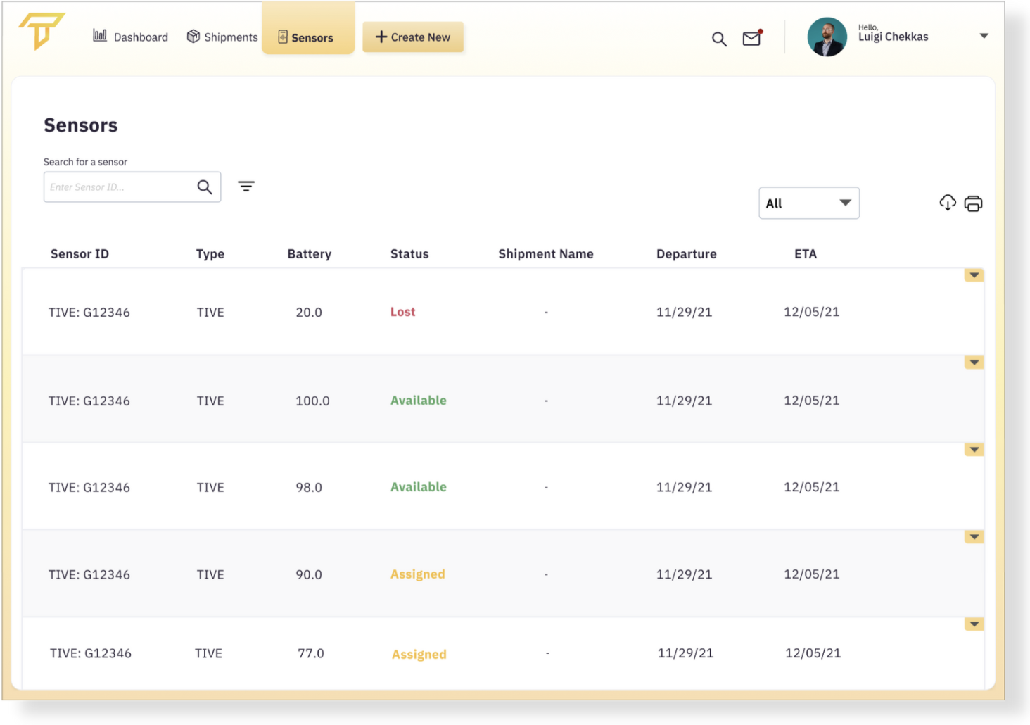
Sensor Management: Final Design
We also learned other competitors platforms include this function, so we felt it was a priority to explore in our design. Users can search at the top of the page and use the drop down arrows to view more details, edit, and delete sensors.
Responsive Design

Notifications & Alerts
We designed the notifications to be non-obtrusive and accessible by clicking the envelope icon at the top. Alert preferences can be managed under the account settings drop down menu, which is where users indicated they would expect to find this during usability testing.
In the final design, users can see which alerts have been read, when the alert occurred, and can also set their status to away to snooze alerts.

Alert Settings: Account Dropdown Menu

Alerts Hub: Version 1

Alerts Hub: Final Design
Just For Fun…
I utilized imagery that showcases the brand colors and connection to agriculture.
I allowed for the use of authorization codes to ensure each user receives the level of access and visibility as intended from the account administrator.

Final Prototype

Final Prototype: Onboarding Flow

Final Prototype: Create Shipment Flow

Final Prototype: Shipments & Sensor Management Screens

Final Prototype: Alerts & Account Settings Menus
Final Thoughts & Future Steps
The final product is visually and functionally a huge improvement over the current app.
One of my biggest takeaways was the importance of user interviews outside of stakeholders and known users of an existing platform. The most valuable feedback came from users sourced from a platform called User Interiews that sources interviewees based on the criteria I provided.
Even though some of the users didn’t even work in a related field such as logistics or agriculture, they provided some of the best feedback regarding intuitiveness and ease of use. One of our goals was to ensure the app had a minimal learning curve for those who may not be familiar with similar platforms as Transparent Path expands its reach and user base, and their insights were crucial in reaching that objective.
Future Steps:
Add an upcoming shipments widget to the Dashboard - users suggested this could help remind them and prepare, especially for recurring shipments.
Consider incorporating weather information - users indicated that could affect shipments and routes, and could better help them plan for delays and issues.
Show input field details when hovering over them with the cursor during shipment creation, instead of using the blue info tags, which must be clicked on.
Consider push notifications to alert users of incoming shipments or to remind them to send back sensors on time. Currently, team members have to email clients to remind them to send back sensors, but it would be optimal if all tasks could be performed within the app.
Add points on the map for users to see exactly where changes in humidity and temperature occurred. This can help them quickly reference issues and identify trends across shipments.