
Pl@ntNet
A UI facelift and an additional new feature for a plant identification app.
DURATION
2 Weeks
MY ROLE
Design: Lo-fi wireframes, sketching, hi-fi prototype
Research: User interviews, affinity mapping, competitive analysis, and prototype testing
Collaborator: Peri Gockeler
✨Short on time? Click here to skip to the final prototype and next steps✨
Overview
The problem: In order to be competitive with other similar plant identification apps, Pl@ntNet needs a way to allow users to submit and identify different types of plant illnesses/diseases, which contributes to their overall mission to catalog data about different plant species.
The solution: Creation of a diagnose illnesses flow and information database, as well as an overall UI facelift which made the app feel more user friendly and less scientific. The new app draws from design elements that many users are familiar with, such as Instagram.
About Pl@ntNet
Pl@ntNet is a community-supported science project available as an app that helps you identify plants with uploaded photo submissions. Submissions are uploaded and verified by other users.
The app aims to create a database and maps of all verified plant submissions to track the prevalence of each species, advancing ecology and botany research worldwide.
Competitive Analysis
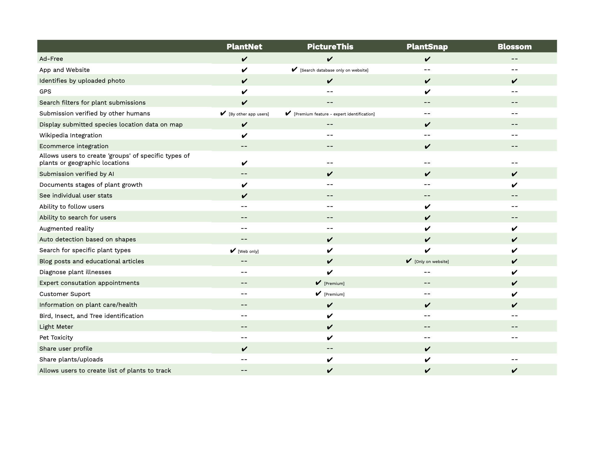
Pl@ntNet Competitive Analysis Chart [click to enlarge]
How might we support Pl@ntNet’s business objectives and goals?
We completed an analysis of the features included in 3 other similar plant identification apps.
One feature other platforms offered that Pl@ntNet does not is a way to diagnose plant issues. This will help Pl@ntNet stay competitive and attract/maintain users.
Pl@ntNet's primary goal is to advance the study of ecology and botany by logging verified sightings and educating users.
Existing App Screens & Project Scope

Pl@ntNet Existing Screens [click to enlarge]: 1: Home Feed, 2: My Groups, 3: Add Photo, 4: Species List, 5: My Account
Home Screen: Some users did not understand this screen was a feed uploaded plants from other users and also felt the ‘details’ and ‘validate’ buttons were also unclear. The feed feels a bit more impersonal than other apps without user images. Users also did not understand you could use the drop down menu at the top to filter feed results.
My Groups: Users did not understand what ‘groups’ were within the app, also it seemed duplicative and could be integrated under the existing feed filter function on the home screen.
Add Photo: Not all users understood that the function of the photo button was to add a new photo of a plant to be validated by other users. At the top, there is a drop down menu where the category you’d like to add the plant to can be selected, which was also unclear.
Species List: We also referred to this as the ‘encyclopedia’. The issue with this screen is the same as most of the others - it wasn’t clear from the icon what this feature was meant for. It houses a complete list of all uploaded plants, which can be sorted by family, genus, or species.
My Account: Typically, ‘My Account’ access is located in the top portion of screens instead of in the lower navigation bar. It’s not a problem that it’s located at the bottom, but it is different than what many users are used to and therefore is not as intuitively placed. Here you can find a list of photos you’ve uploaded, notifications, statistics, and other app/account settings.
In order to design the most useful and intuitive app experience possible, we needed to better understand our users.
Meet The Users!
We interviewed 5 people who indicated they either have an interest in plants and plant care, or had used some type of plant identification app in the past. Only 1/5 users had never used a similar app.
Key Findings:
Most users had positive past experiences identifying plants and diseases on similar apps
If the app wasn’t able to ID, users appreciate alternative suggestions to explore
Users are motivated to learn more about plants so they don’t kill them, and the most preferred way of learning is through reading and articles
If users weren’t using a plant app to ID illnesses, they used Google and felt overwhelmed by the number of options and information available in the search results.
All users have had a sick or diseased plant before, and for some, the experience has kept them from wanting to own plants because the plant died as a result.

Pl@ntNet affinity map [click to enlarge]
Creating Personas
Using our affinity map as a guide, we were able to extract two distinct user personas, each with different wants & needs: Aspiring Horticulturist [primary] and Plant Professional [secondary].

Pl@ntNet user persona [click to enlarge]
Problem Statements
Aspiring Horticulturist: This user needs a platform to teach them the basics of plant identification & care.
Plant Professional: This user needs a platform to supplement and expand their existing knowledge about plant illnesses and diseases.
Solutions
All Users:
The ‘Ask An Expert’ feature ensures the users don’t ever leave the app without the information they are seeking
Labeled icons in navigation bar to help users understand functions
Combined ‘My Groups’ and ‘Filters’ to simplify feed content curation
Changed the existing camera icon to a leaf and plus sign to more strongly suggest the function of adding a plant to be verified
Moved ‘My Account” from the bottom navigation bar to make room for the diagnose icon
Aspiring Horticulturist - Features that support intuitive interactions and learning
Need to accommodate for varying levels of ID accuracy in the app - other viable suggestions need to be provided in case ID is incorrect to eliminate the need for the user to search on their own.
New users need full support and learning resources - additional articles and blog posts further learning efforts
Plant Professional - Features that support deeper supplemental learning to existing plant knowledge
Experienced users need to supplement their existing knowledge -the app must be intuitive with a quick ID flow so users can confirm their hypothesis without hassle
With a firm understanding of both our competitors and users, we began the design process with sketching and wireframing.
Sketching & Wireframes
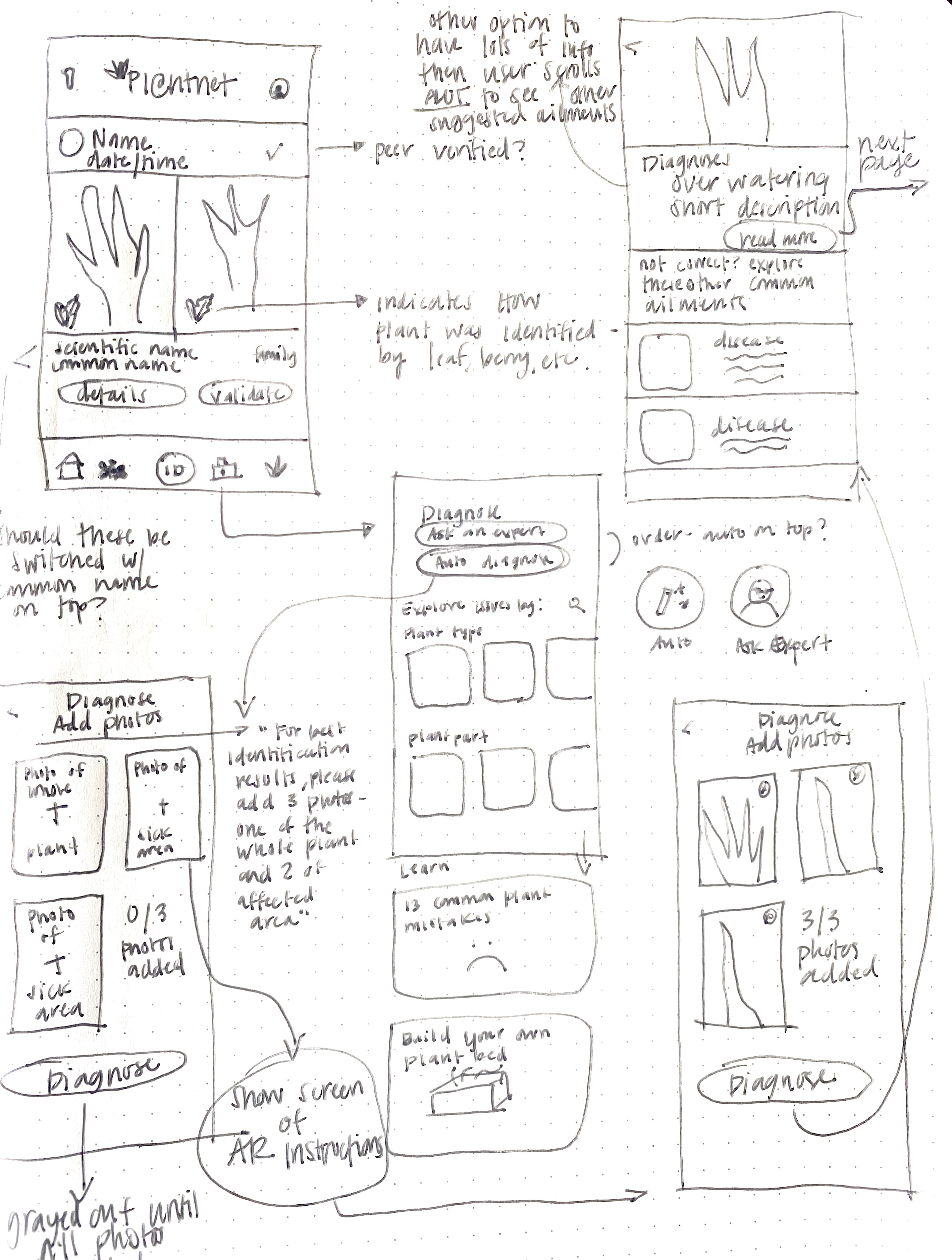
User Test 1: User Flow
Task: You’ve noticed your plant has some brown and wilted leaves and isn’t as healthy looking as it had been in the past. How would you use the app to identify and address the issue?
Other Questions:
Describe what you see on this initial page. What type of information is being displayed?
How would you alter the type of posts shared on the home feed?
You’d like to identify a new plant, describe how you might complete this task.
Explain what you see on the main diagnosis page.
You’ve received an auto diagnosis of your plant’s issue, and you believe it’s not correct. What would you do next?
Is there any other information you’d want to learn about your plant aside from what is shown here on the app?
Is there any feedback regarding aspects of the experience that were intuitive or difficult to navigate?
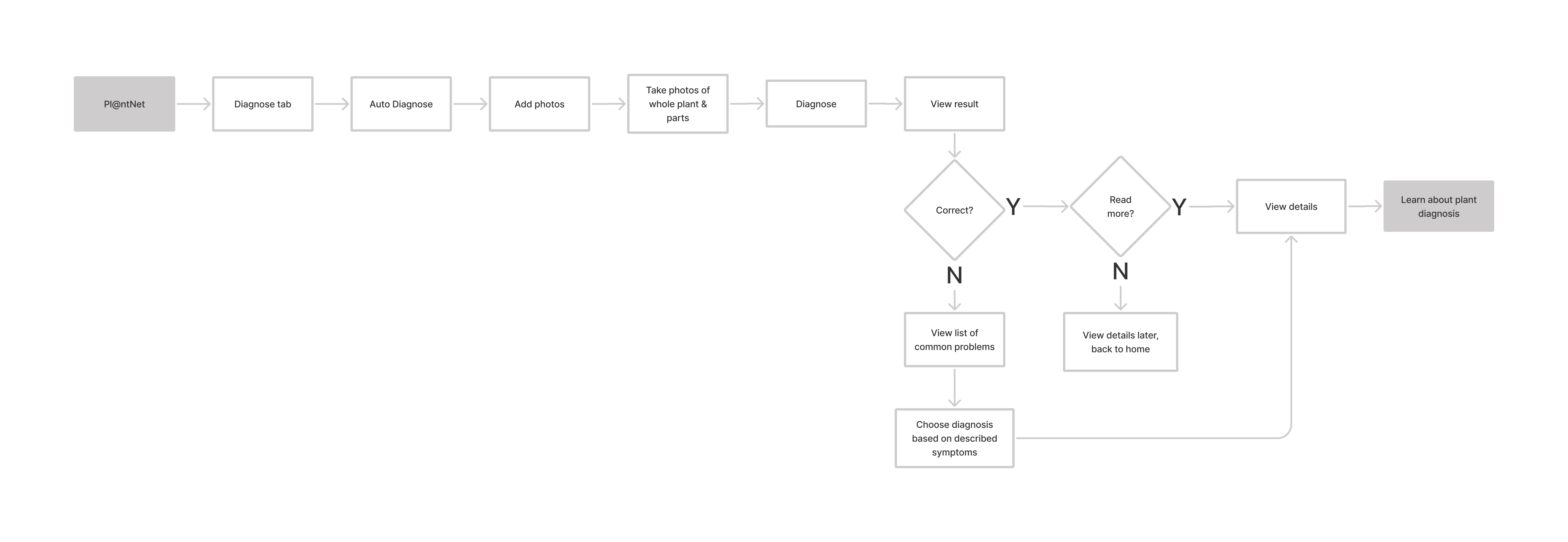
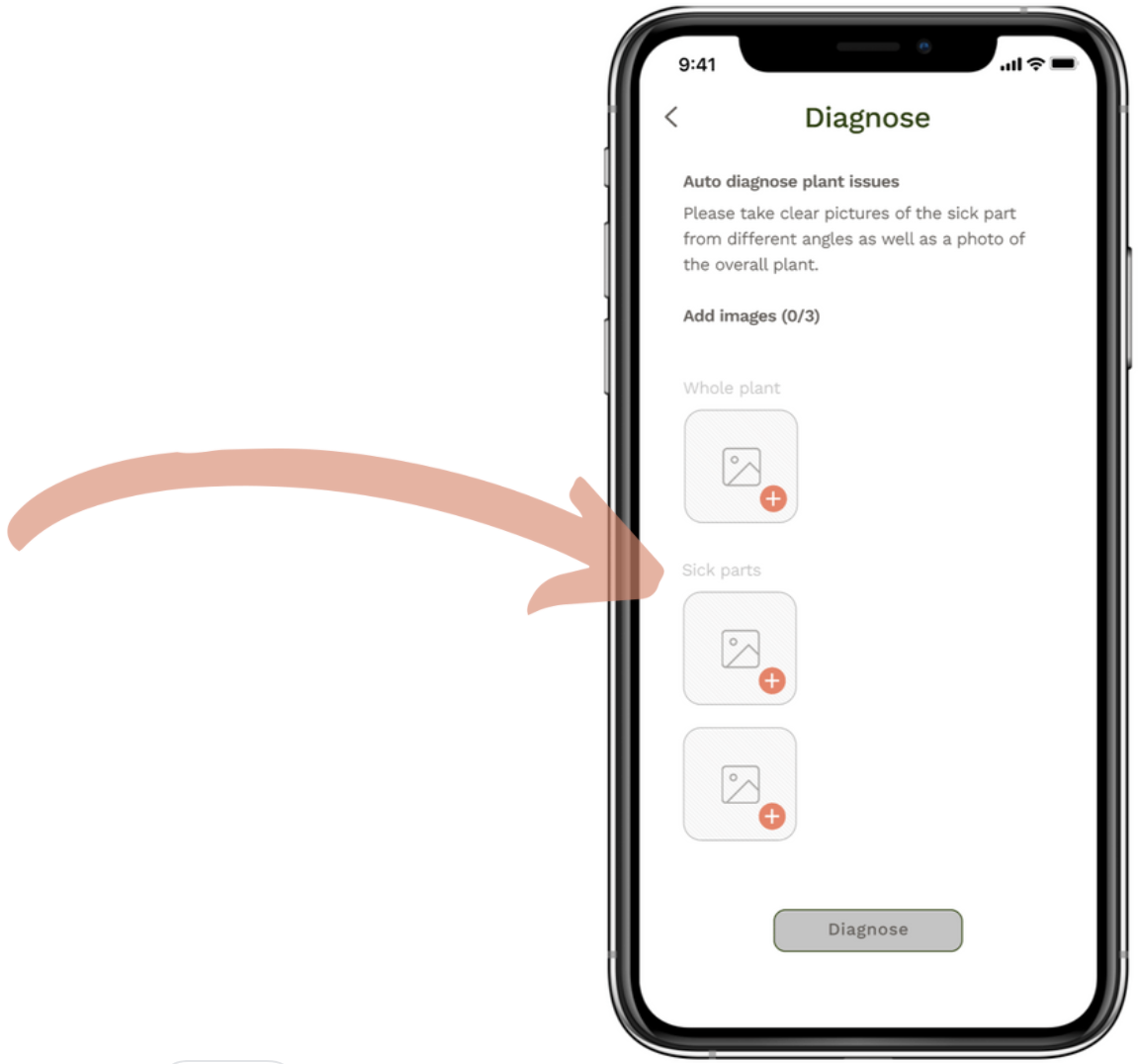
New User Flow: Home > Choose diagnose tab > Select Auto-diagnose > Take photos of full plant and sick areas > Review your photos > Start diagnosis > View diagnosis > Read information
Usability Test 1: Findings & Next Steps

Key Findings:
3/3 users successfully completed flow
2/3 users recognized filter
Users are content with the information provided
1 user thought to diagnose from “My Plants”
1 user thought to diagnose from “Add”

Add Button Pain Points:
Location was distracting to users
Not cohesive with IOS
Some users did not recognize the symbol as an add button for identifications
Moved into navigation bar for more cohesiveness, and moved groups into the feed filter on the home page.

Validate Button Pain Points:
All users did not know what the validate button was for
Changed to "Validate ID" for next iteration to hopefully provide more clarity
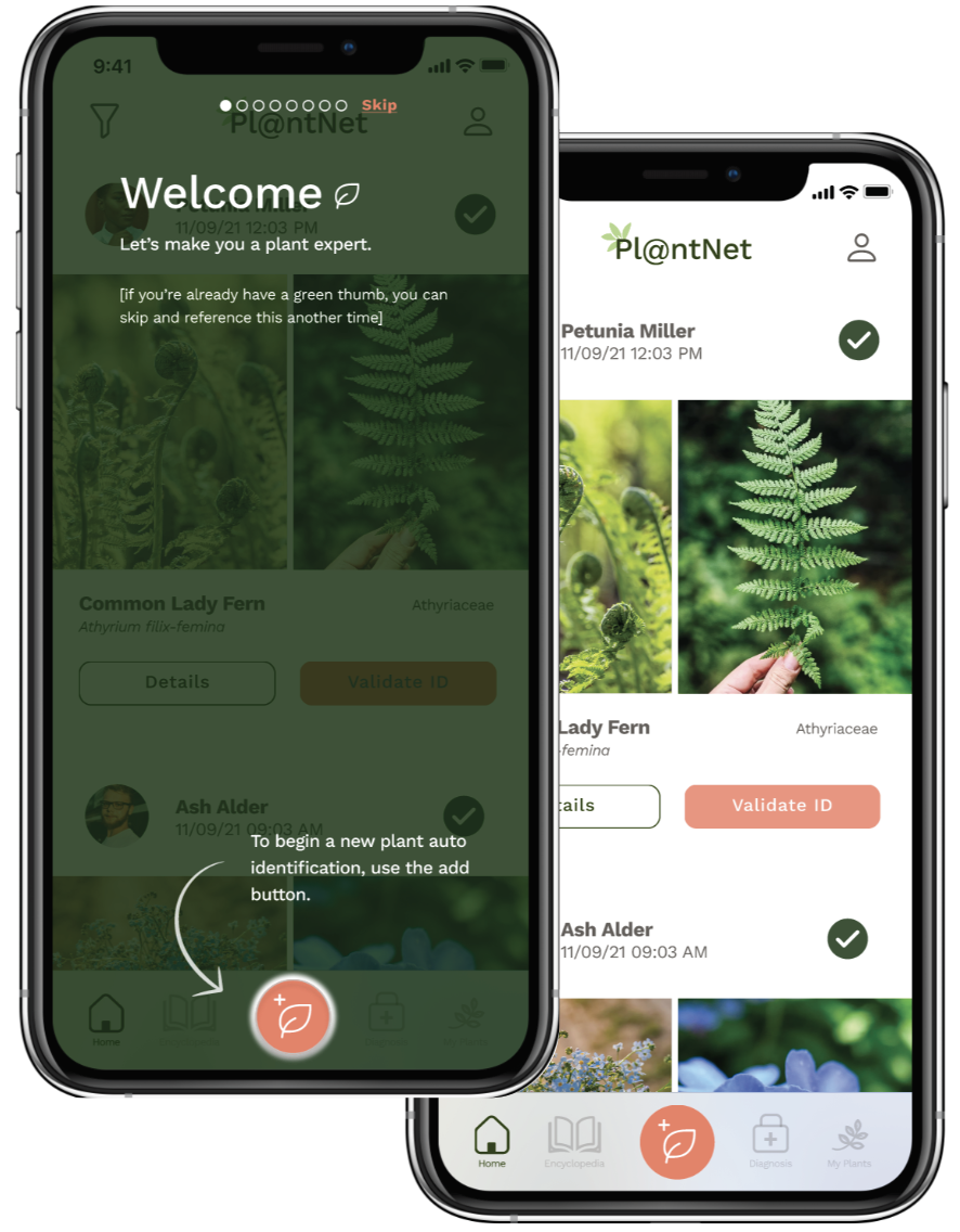
Need to give users better understanding of what the app does, so that they know users validate IDs - onboarding can help with this!
Revisions
Revisions:
Add Onboarding: This will help orient users to the different icons and functions of the app. Specifically, we were hoping this would help users understand the use of the ‘validate ID’ button.
Rethink add button: The first design iteration included an ‘add’ button as a floating action button [FAB]. This design style is part of material design and not IOS. Therefore, we reconfigured the bottom navigation bar [more on that below], and integrated the add button in the center so it is easy to find.
Specify validate button: We revised the verbiage of the ‘validate’ button to read ‘validate ID’ to provide more clarity.
Rethink navigation: We integrated ‘groups’ into ‘filters’ and moved the add button to the bottom navigation bar so it is the main focus and easy to locate. We believed ‘groups’ integrated well with ‘filters’ because both functions allow you to curate the content shown on the feed home screen.
Usability Test 2: Findings & Next Steps
Key Findings:
2/3 users successfully completed the flow.
2/3 users recognized the filter function.
Users are content with the information provided during onboarding.
1 user thought to diagnose from “Add Plant” button.
Diagnose Pain Point:
Changed verbiage from 'plant part' to 'sick part' for more clarity.
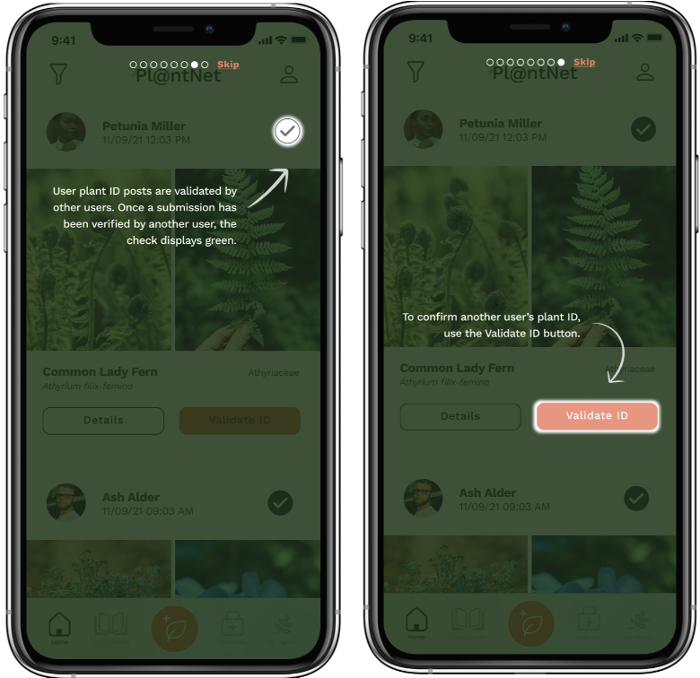
Validate ID Onboarding Pain Point:
One person still had confusion about the ‘Validate ID’ button even after onboarding. We realized that the order of screens needed to be switched - users should be introduced to the concept of validating IDs BEFORE the validate ID button. Additional user testing could validate this hypothesis.
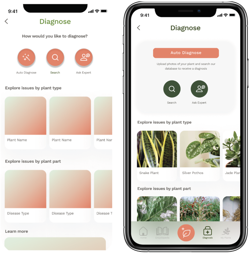
Auto Diagnose Pain Point:
Users didn't know what the ‘Auto Diagnose' function would do exactly
In previous versions, the ‘Auto Diagnose’ button was the same color and shape as other buttons. The lack of hierarchy made this option harder to find and it was less likely it would be the user’s first selection. We changed its location to the top of the page, and revised the color to red so it stands out.
Just For Fun…

Pl@ntNet existing landing page

New landing page for Pl@ntNet
Key Points:
The existing landing page looks very ‘scientific’ and is lacking in alignment and visual design. I incorporated an eye-catching hero image and modified the layout.
I modified the tagline to address the diagnose feature as well as plant ID.
The navigation was revised to match the verbiage of the functions available on the app: Identify, Encyclopedia, and Diagnose.
Feedback:
Perhaps the ‘Register’ button should be a different color or shaded so it draws the user’s attention.
Due to the fact that the platform runs largely on donations, I included a link to donate under the ‘Let’s get started’ button. However, some people may not read the fine print, so I’d want to rethink how and where this is incorporated to elicit the most user donations possible.
Final Prototype

Pl@ntNet onboarding flow

Pl@ntNet home feed, filters, & diagnose flow
Final Thoughts & Next Steps
The final product is visually and functionally a huge improvement over the current app. The design brings life/appeal to the brand which makes it feel more approachable to a wider audience. The new ‘diagnose’ feature attracts more users and allows Pl@ntNet to be more competitive with other similar apps that already offer this function while contributing to its core mission of building a knowledge database.
Overall, adding an onboarding flow to educate users about the different features within the app and their functionality seemed to yield the biggest usability improvements during testing. During the second test, when asked why they made each selection while completing the user flow, users responded ‘because I learned about it in the onboarding’.
Next Steps
Conduct 3rd usability test on high fidelity prototype
Complete UI & interaction for features under ‘My Account’
Re-examine the user flow for the ‘Add a Plant’ function to ensure it follows the framework of the new ‘Auto Diagnose’ feature.